Typically the first stage of any creative project is getting to know your subject. But this time we were able to start at turbo-blast given that Edīte, the manager for the project, was a digital ambassador at Study In Sweden just a year ago.
We proceeded to gather further insights from the blog’s current readers and writers, accumulating research that would later inform our design choices. It turns out, when a country’s image is at stake, people really join forces! (A heartfelt thanks to all who participated!)
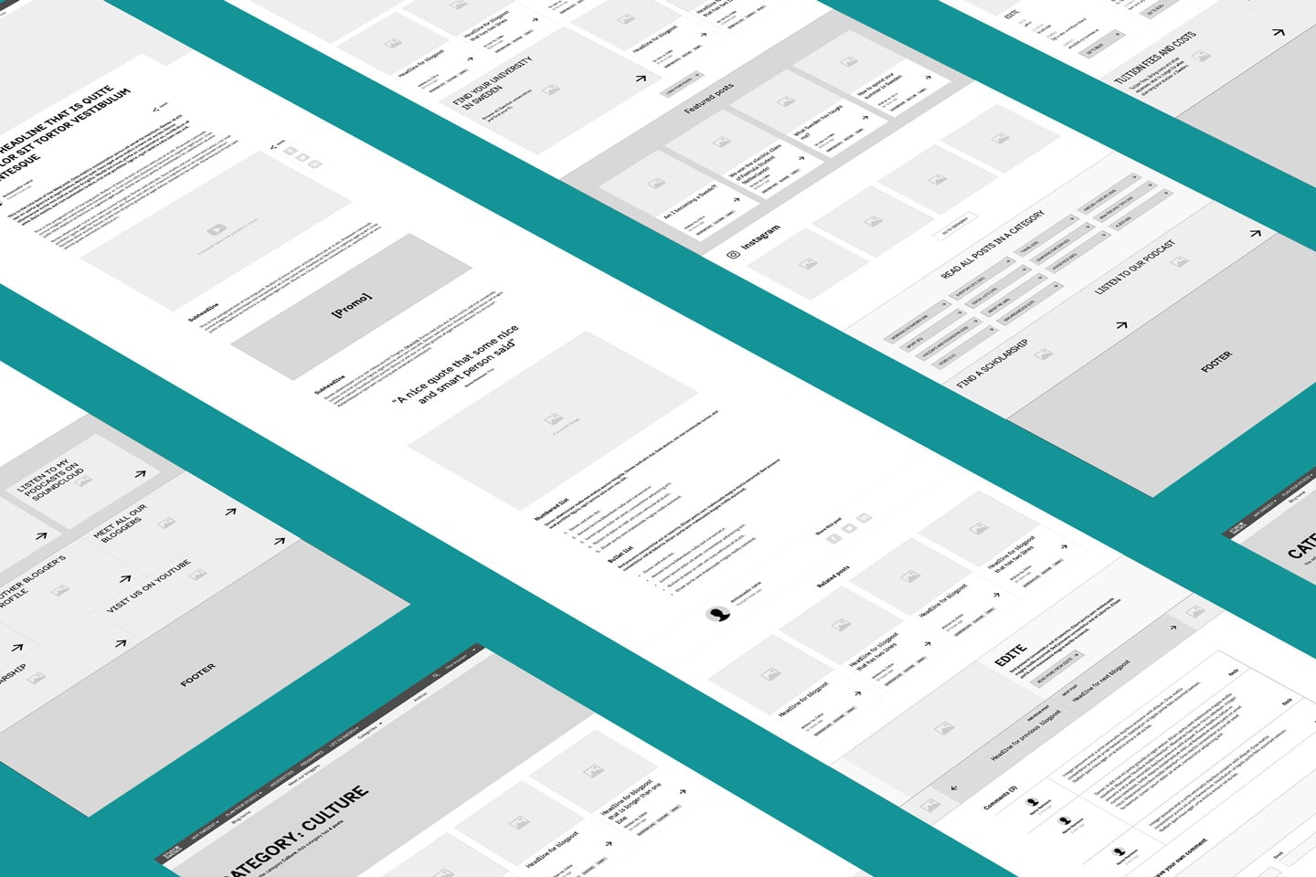
This wasn’t just a beautifying project—we saw it as crucial to combine insights from stakeholders, previous user research and user interviews. After all, we had to come up with solutions that would make visitors engage with the site for longer and, hopefully, convince them that Sweden is the perfect place to move for their next degree.
The design
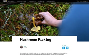
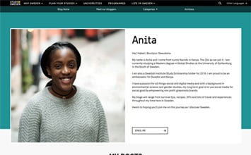
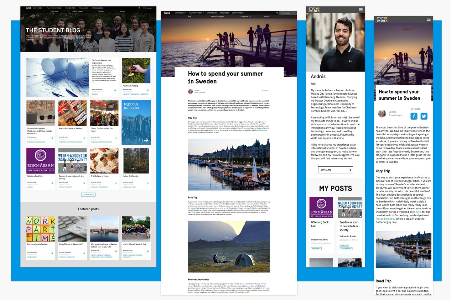
The aim was to give more exposure to the bloggers and their own content. And we wanted to be smarter about providing the most relevant content to the reader through seamless navigation. As with everything that’s quintessentially Swedish, we learned that simplicity is what matters. We made it easier to read, search and get inspired about starting your next life chapter in Sweden.
We also met friends new and old along the way, as we collaborated with the digital agency Fröjd, who developed the blog. And Edīte got to work with her pals on the digital ambassador team. This time it wasn’t to write, but to lead a workshop on creating the future content that will shine with the help of the new design. Roligt!
