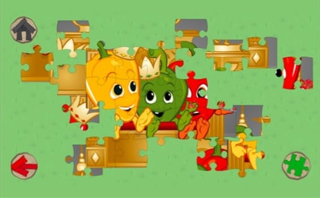
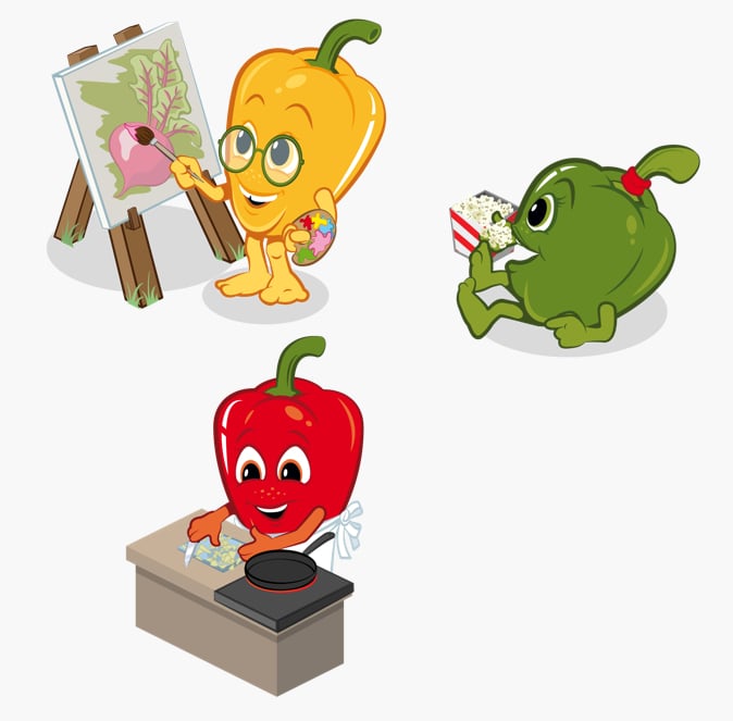
To get their message across in a jolly and captivating way, ICA Kvantum created Papricaklubben, a members club for children. The club mascots are three wide-eyed bell peppers: Grönis, Gulis and Rödis.
Papricaklubben already has its own newspaper and app, but ICA Kvantum wanted to take it a step further. They came to Fully with the desire for a Papricaklubben website. It needed to be, in essence, an informational website. But one that truly appealed to and engaged youngins with their goldfish-y brains.
Since we know a thing or three about making the web fun, it was an ideal project for us. The answer was immediately clear. We would gamify the heck out of it.
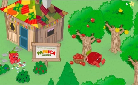
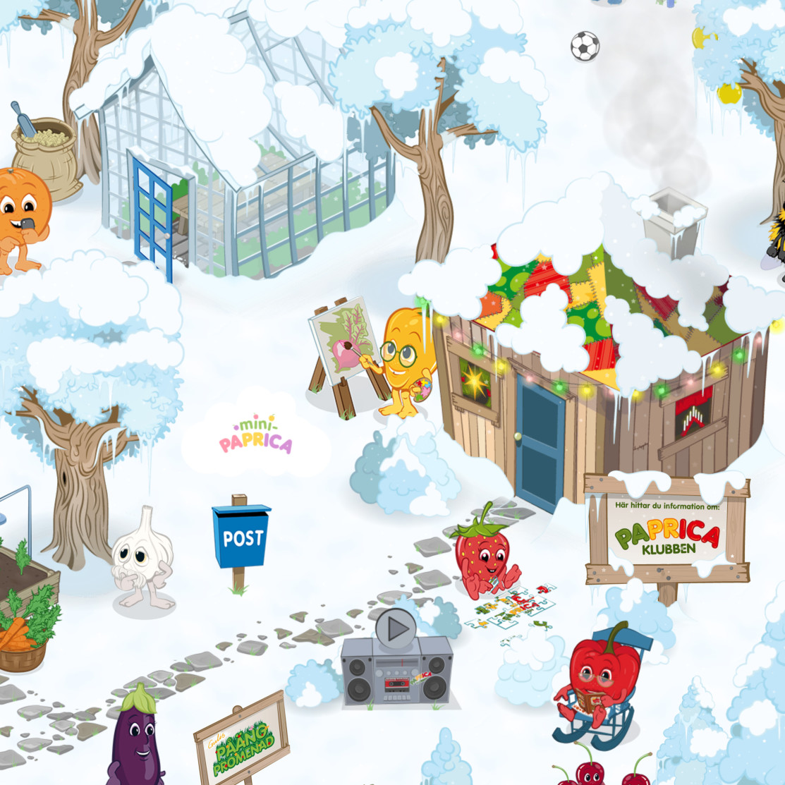
Here’s what we built: papricaklubben.se. An entire world for Gulis, Grönis, and Rodis to call home.
Jonas made the brilliant call of building it on an isometric grid. This let us represent significant depth, range and 3D characters on the 2D surface of a digital screen. All while remaining within reasonable bandwidth parameters.
While it looks like one big game, Papricaklubben is still an informational website. For instance, a full menu is present… it’s just not a menu as you’re used to seeing it. The house is “home” which takes you to ICA’s site to learn more about the club. The post box shows the address kids can send their drawings. And so on and so forth.
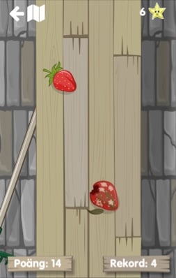
The navigation is rather straightforward: everything that moves is clickable. Embedded in the clickable objects are numerous different formats for taking in information: text with voiceovers, recipes with pictures, a “movie theater” playing Papricaklubben YouTube videos. And then there’s just the fun stuff, like the bad apple sorting game located in the greenhouse.
