One day Matbaren came to us with an idea about placing their buffet carts in gyms and sport facilities. These would be stocked with extra healthy food suited to fitness and nutrition goals.
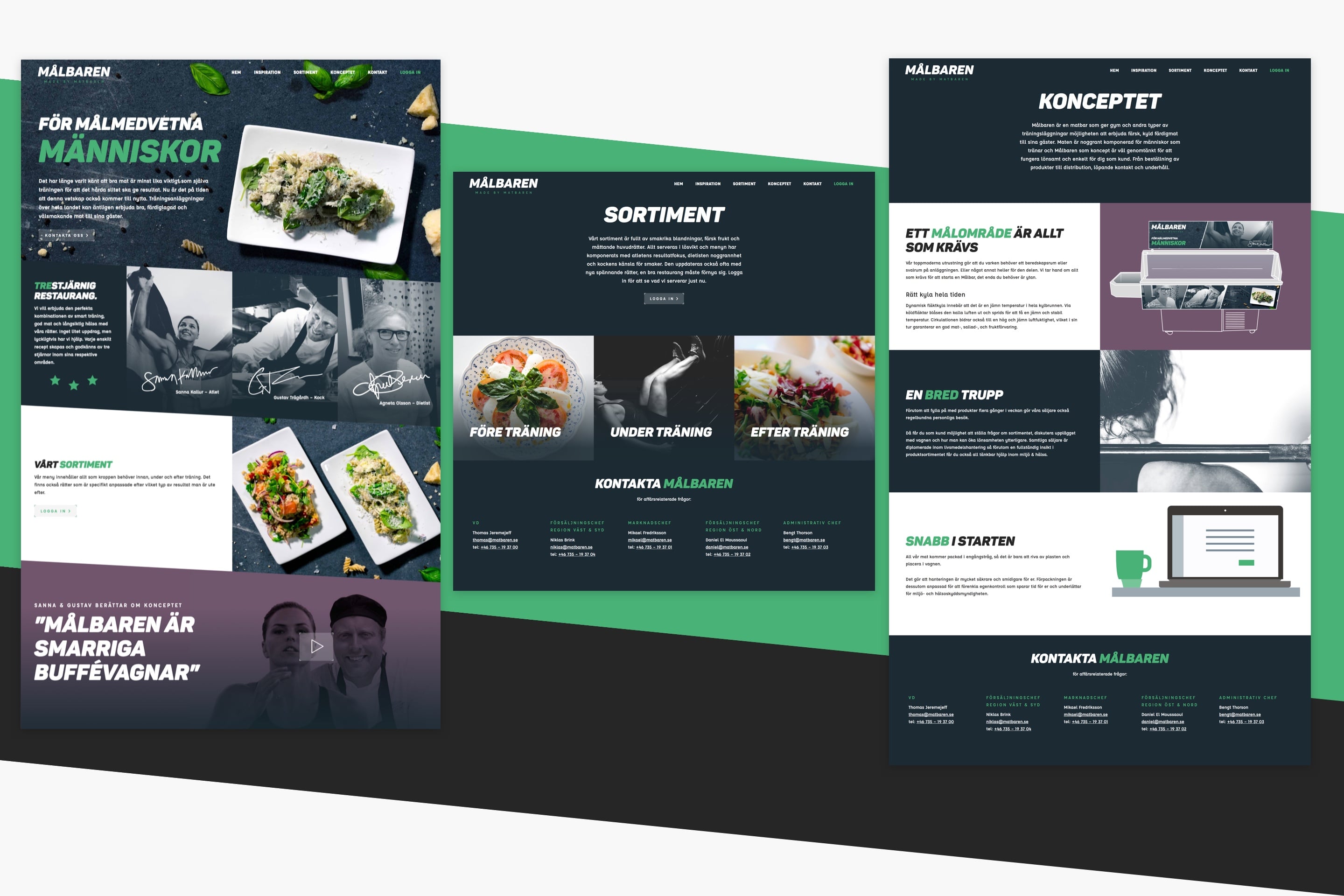
They asked us to come up with a brand concept from the ground up, from a name and tagline to a graphic toolkit. And of course, a website and everything on it.
Branding, go!
In devising a name, we searched for a single word that would combine the values of both exercise and food. It needed to be memorable and show a kinship with Matbaren’s other concepts.
We came up with the name Målbaren, which is a play on words in Swedish, as mål means both “meal” and “goal. The tagline, “för målmedvetna människor” means both “for determined people” and “for food conscious people.”
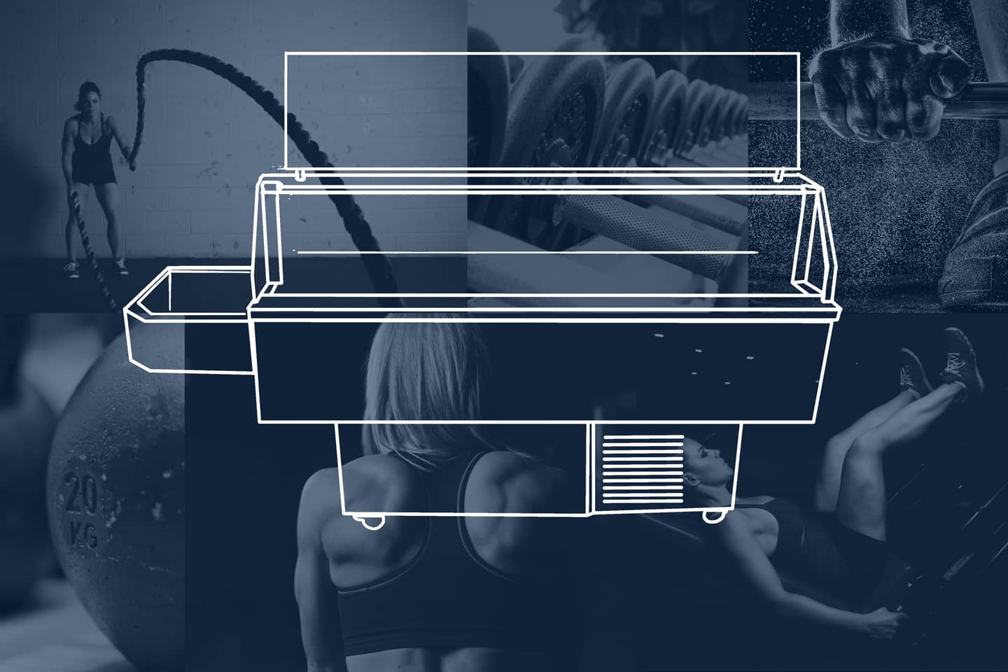
When it came to animating the concept with visuals, we started off by thinking about the food cart as a design element in the space around it. It needed to be a natural part of its athletic environment, yet still make a graphic impact.
These days many of the big athletic brands are putting the technical aspects of their products front and center, which lends itself to a futuristic, fast-paced feel. We thought it would be interesting to apply this approach to a food concept. So we did.
But we didn’t go over the top with it. We went for streamlined and sporty with subtle details.
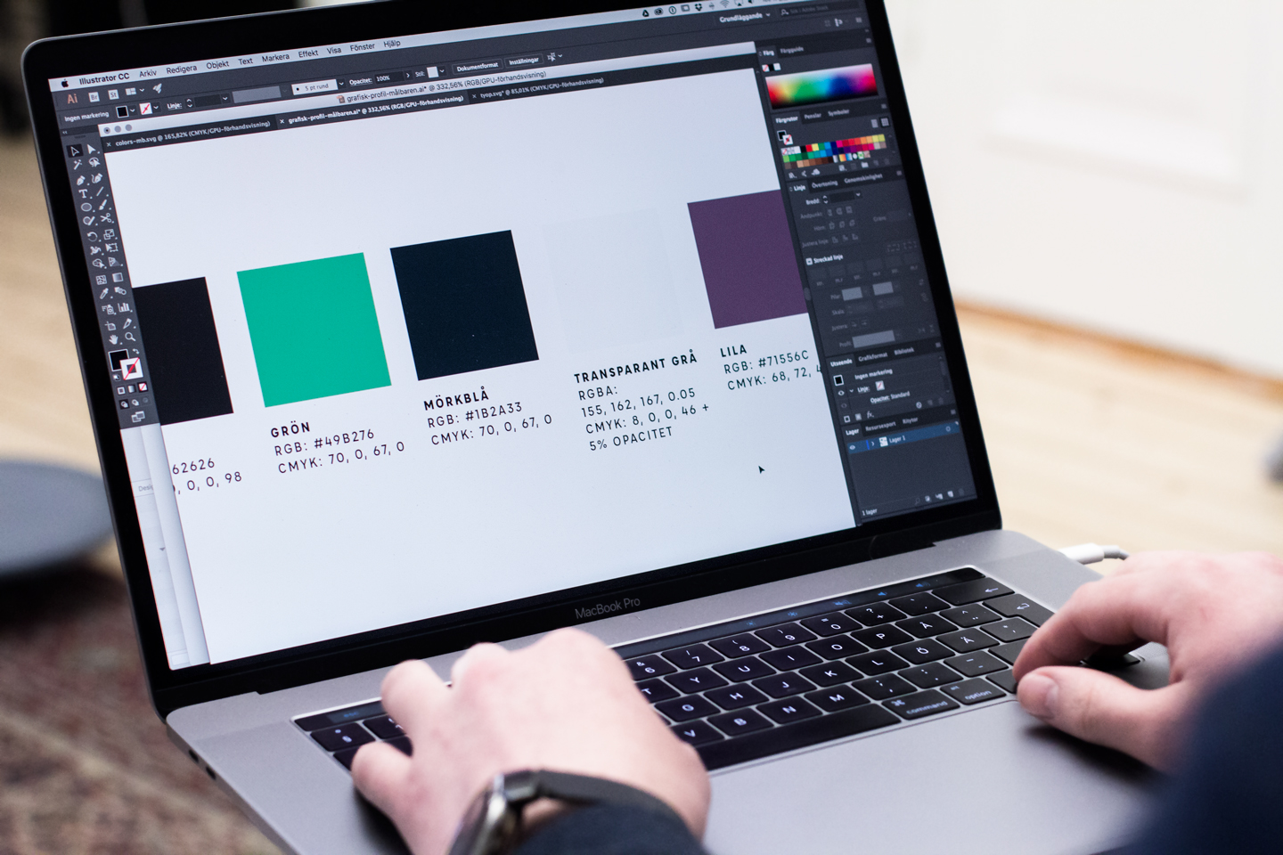
The color palette needed to draw inspiration from the workout world as well as look good on the web next to food images (we weren’t feeling neon, for example). I settled on this green as a primary color, as it has an energizing blue tone to it.
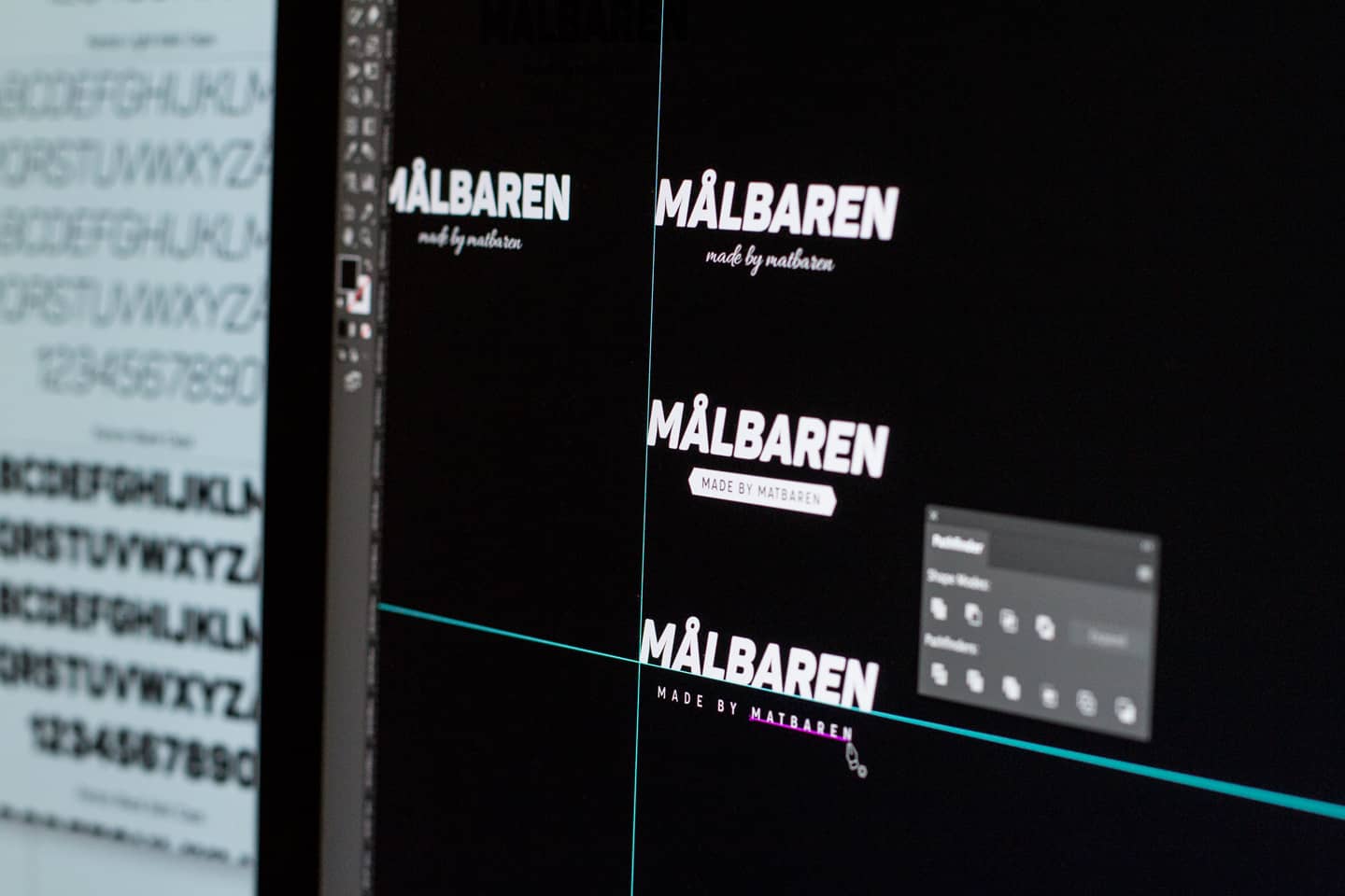
For the typeface in the logo, I wanted something with power and energy, and with an anatomical feel if I could find it. I decided quite quickly it should be in italic, which gives the impression of forward-moving speed. And in bold too, for all the obvious reasons. Panton Italic was the answer. If you look closely at the hairline creases in the M, A, and N it looks somewhat like flexed muscles.
