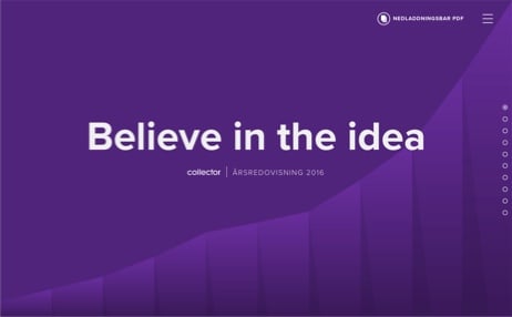
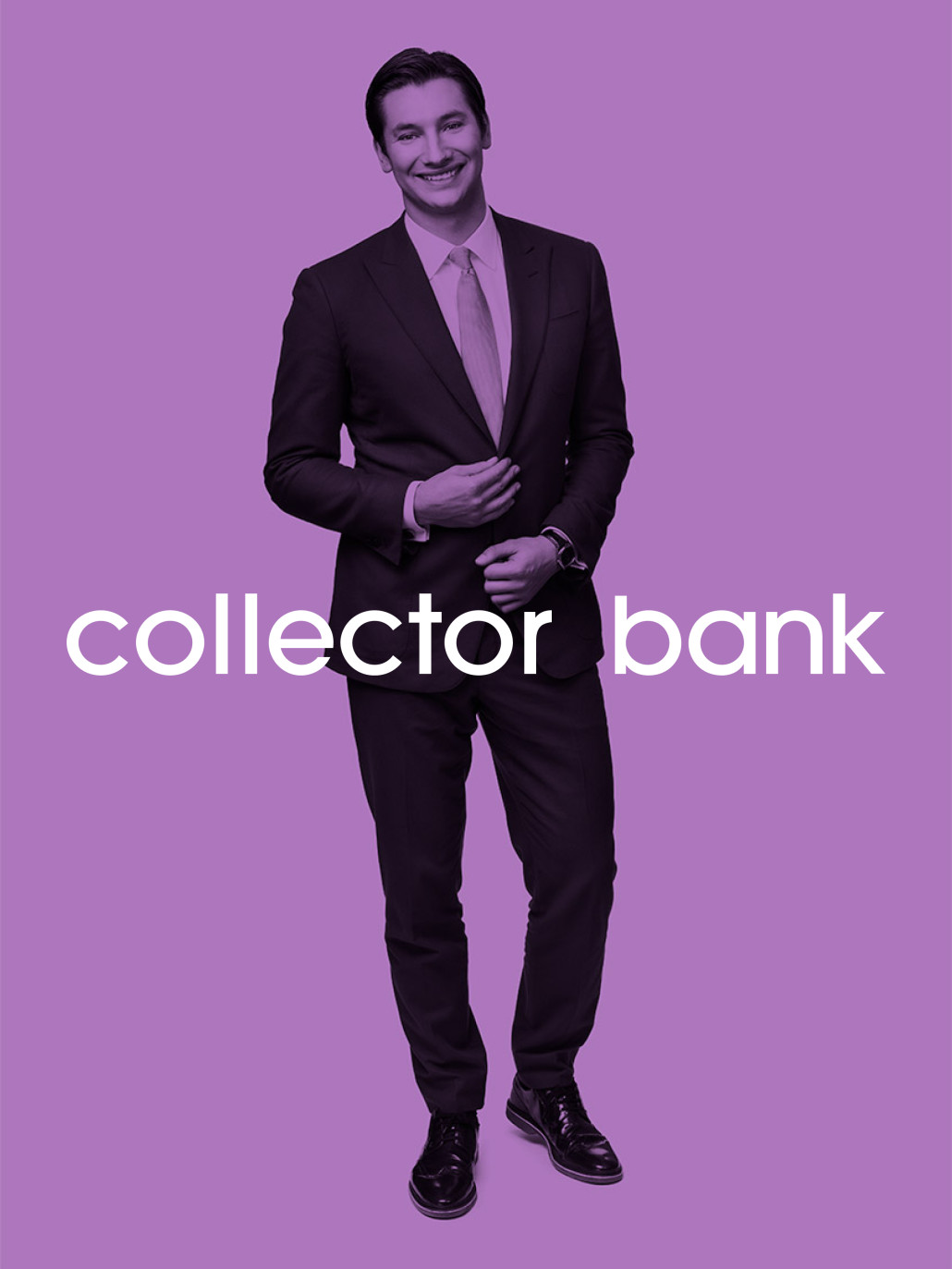
Collector tasked our friends at DDB with creating a campaign page that presented their 2016 Financial Report in an understandable and compelling way. They came up with inspired idea of bringing in a famous Swedish podcaster, Alexander Pärleros.
DDB then came to us to turn their creative vision into an internet reality, which entailed:
- Web development
- Motion graphics
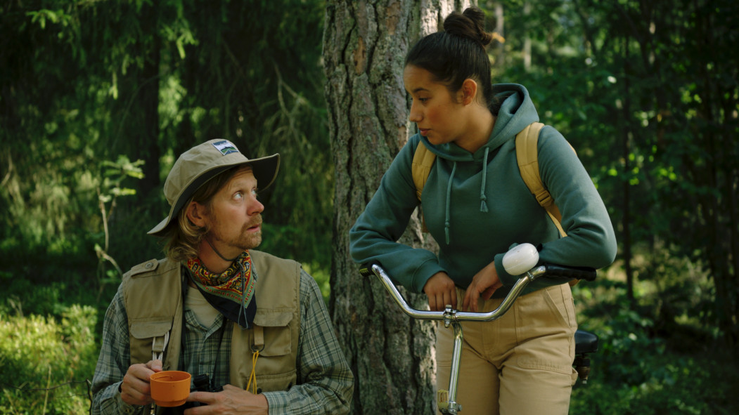
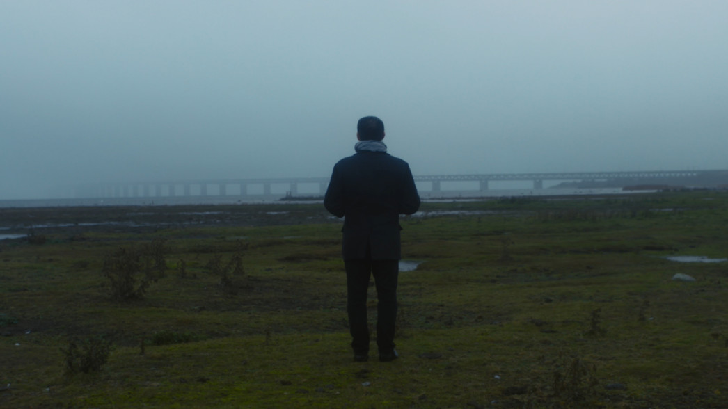
- 7 short films (filming & post-production)
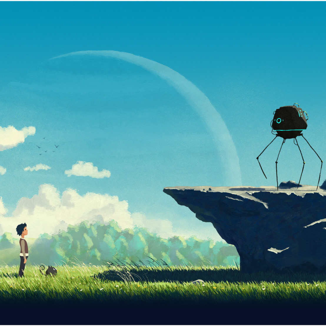
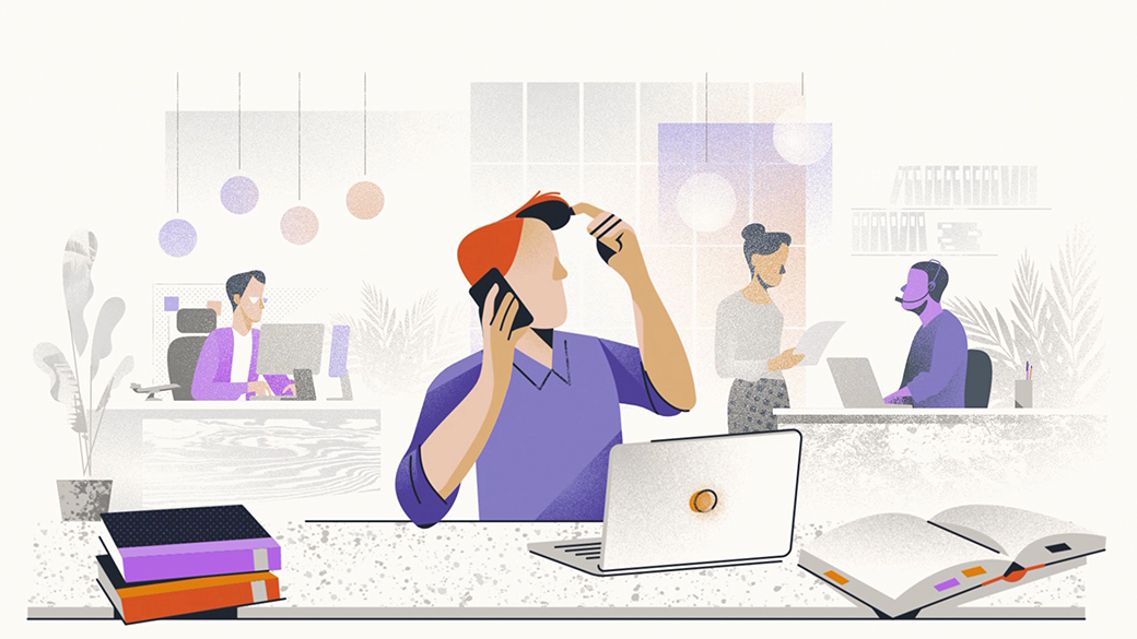
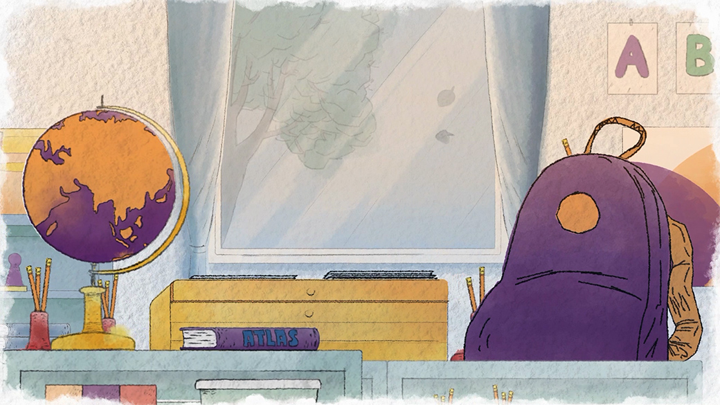
- 2 graphic films (original art & animation)
For a bit more background on the concept, Alexander’s “Framgångspodden” (which translates to The Success Podcast) tells stories of Nordic entrepreneurs disrupting industries through creativity and sheer determination.
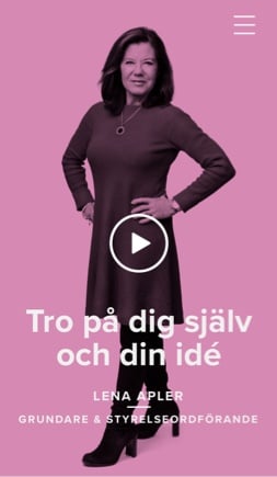
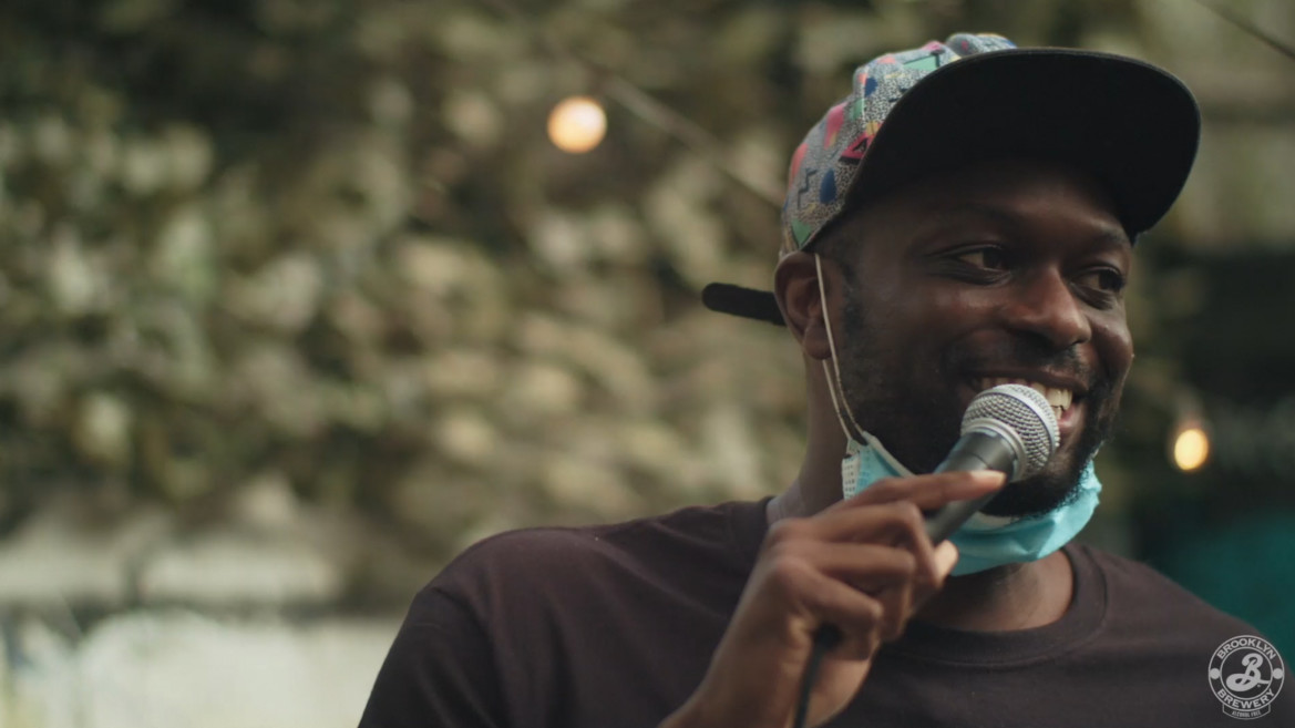
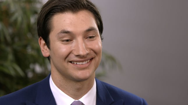
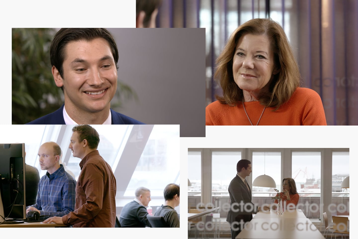
Similar to his role in his own podcast, Alexander is positioned as the “host” of the Collector campaign page. He conducts a series of interviews with the heads of key departments at Collector, which we filmed at their Gothenburg headquarters.
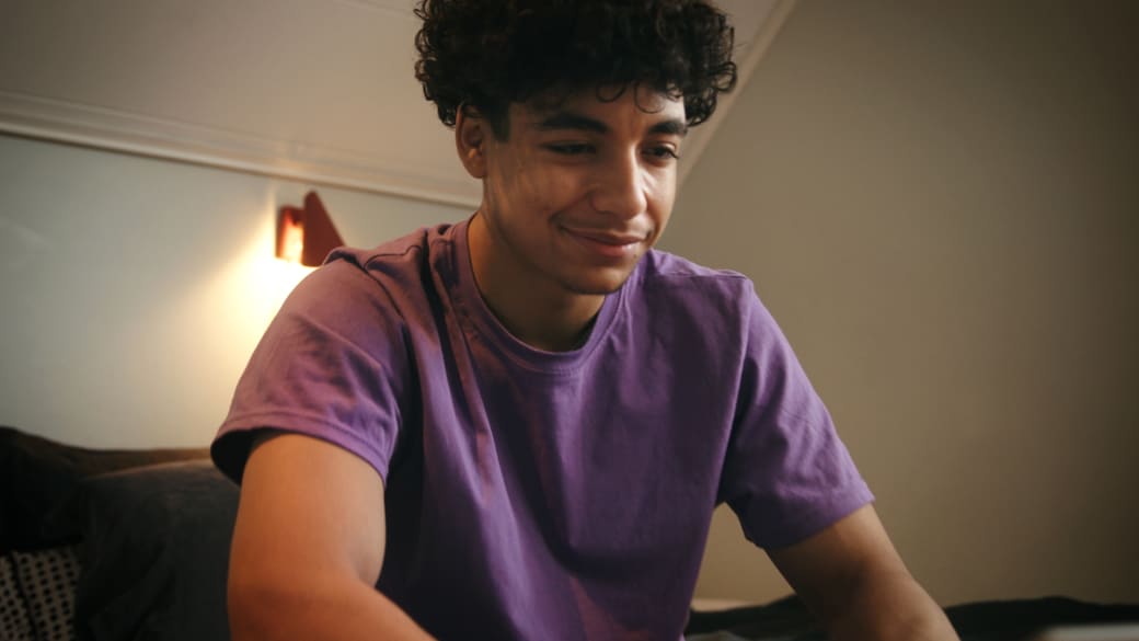
To mix up the static “talking heads” factor, we filmed quite a bit of B roll showing Collector employees doing their everyday work. The footage flaunts the company culture perfectly: open and relaxed, yet intelligent, tuned-in and motivated. With many of the computer screens showing code, it drives home the fact that Collector is indeed an IT powerhouse.
Making it move
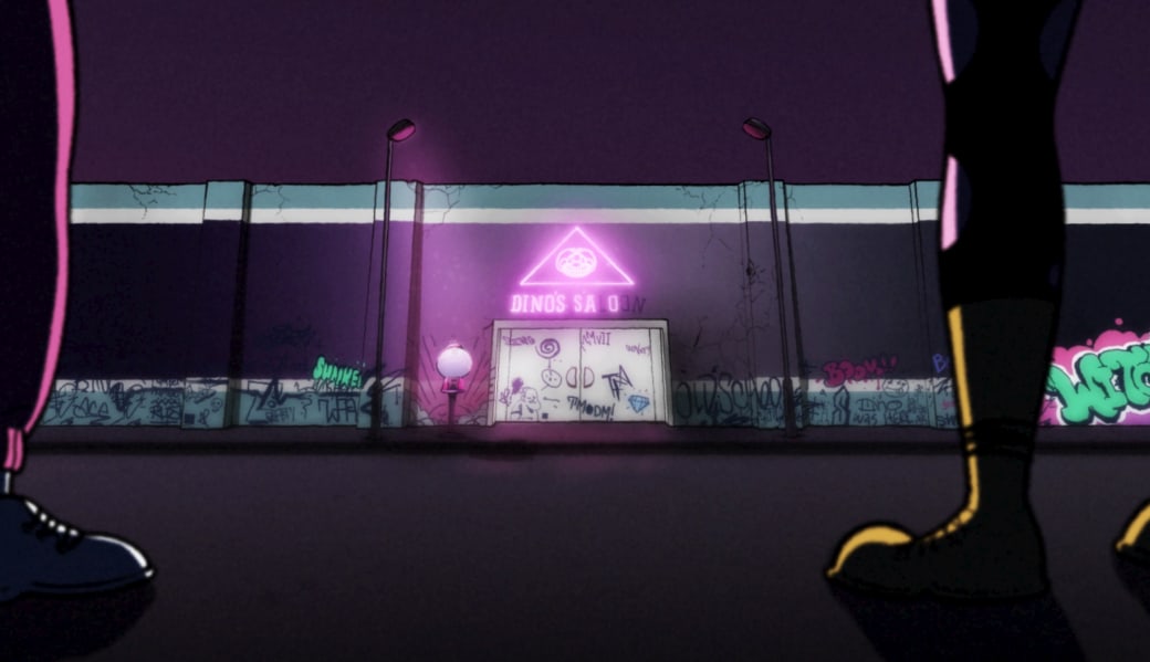
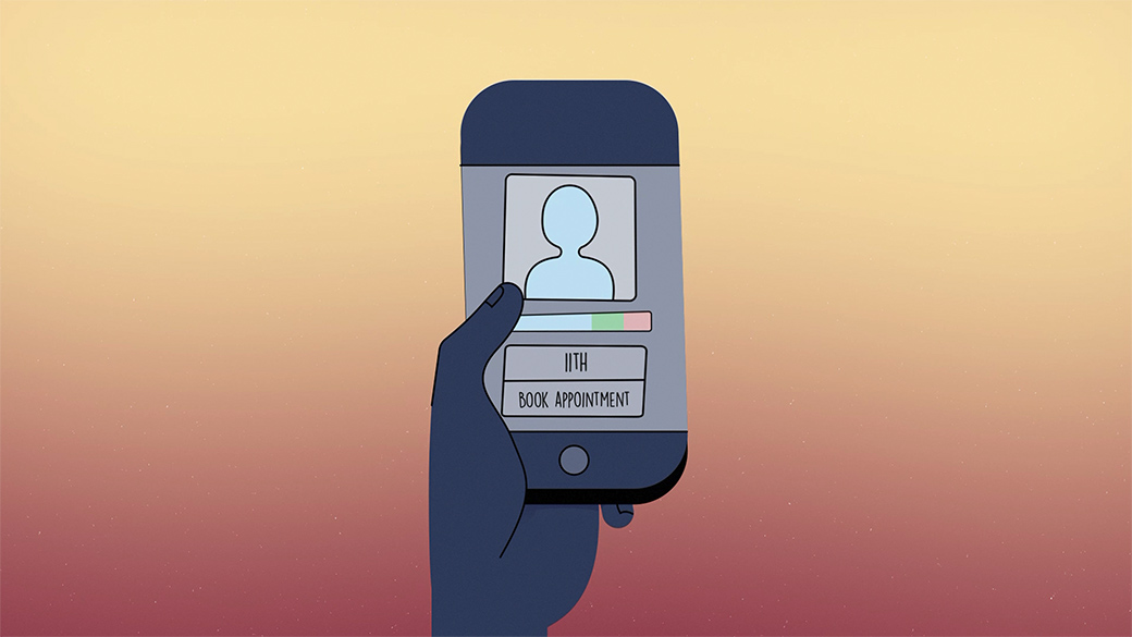
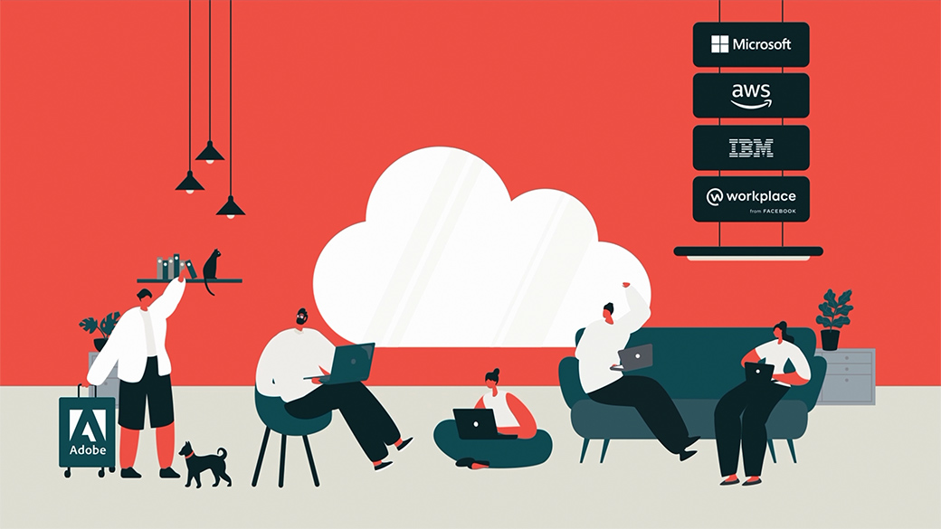
We also made two infographic short films to illustrate Collector’s impressive business success stories from last year. They are all about banking services, which can easily be snooze-inducing. So in the translation to movies, we aimed to make them brisk, inspiring stories. With a hint of comedy too.


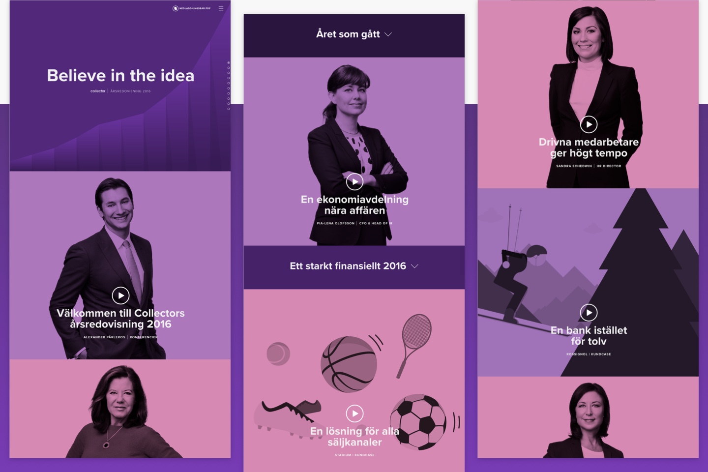
When it came to the design of the web page, we put a lot of power in the hands of the user.
They could make their own choice about how much information they wanted to choose about a topic by using the toggle-down sections. Or they could take a passive approach: we wrapped the Vimeo API in a playlist function so the films would play in a continuous sequence, Netflix-binging style.
Overall, this site bears many of the genetic markers of a Fully Studios production:
- Subtle use of motion graphics throughout, typically triggered by hovers.
- A simple, vibrant user interface
- A complex technical underbelly (the video sequencing took a lot of elbow grease to become so seamless, for instance).
We’re quite pleased with the way this project turned out, and about what it means for us. Last year we set a goal to be a half web, half film studio. Judging by the extent of in-house talent that generated the art, film and code on this campaign page, it looks like we’ve made it. And in good time too!
