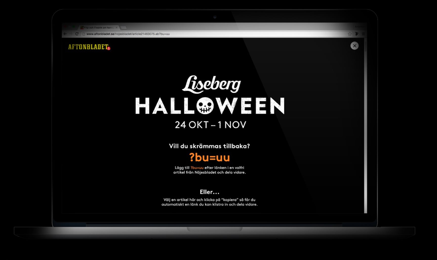
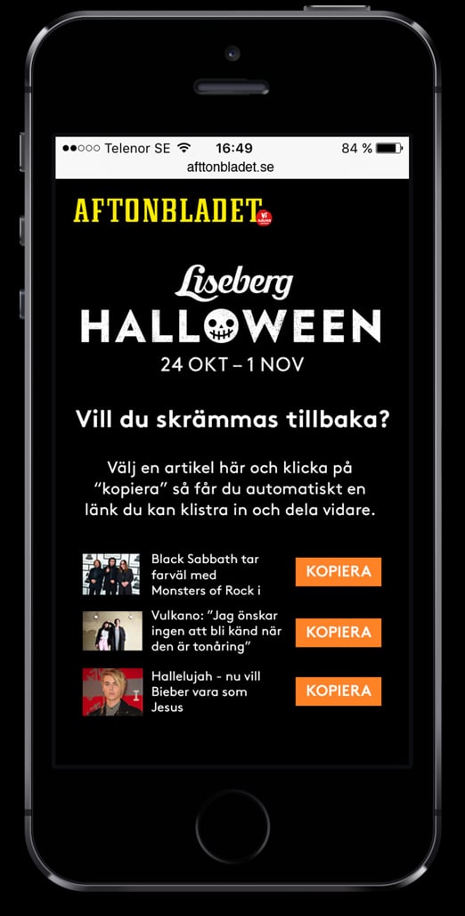
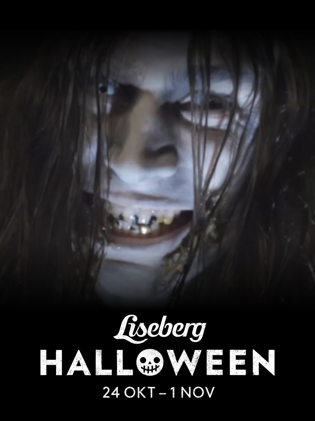
They began with the Halloween thing more recently, and wanted to pull off a digital marketing stunt that would pique public interest and drive more foot traffic to the park. To do this, they were toying with the question how to make a traditional “boo!” kind of scare go digital.
The idea
Together with DDB, we began to flesh out an idea: to scare the lights out of people when they’re reading (what they think is) a normal web article and have a terrifying face/scream pop up out of nowhere.
To do the idea any justice, the execution had to be perfect. We completely cleared our schedules to make this thing come aaaalive.
In the process, we learned that scaring someone in the digital realm shares the same principles as in the real world.
How to scare someone
1. Find a great hiding place
The more unsuspecting your target is, the better.
In this case the hiding place would be in the webpages of Nöjesbladet, Sweden’s largest entertainment website.
We worked extensively with Nöjesbladet’s technical team to embed the scare-code on every article that appeared on their front page. All that was needed to trigger it was the addition of a few characters at the end of article’s URL. We covered our footprints well.
The best bit was the screen override would happen when the viewer scrolled halfway down, so they’d be distracted by reading when AAHHH THE HORROR!

2. Don’t give yourself away early
Ssssshhhhh.
The loading had to be just right. The video clip and the audio had to come at precisely the same time – one couldn’t come before the other. Not even a millisecond of a glitch.
When working across multiple different browsers and devices, getting this perfect took some doing.
The video was too heavy on bandwidth so to speed up the loading time, we divided the video into an image sequence and removed a few frames. This also solved the problem of display on smartphones so users wouldn’t need to press “play” to show the video.
3. Look scary. Sound scary. Be scary.
Go all out.
The video DDB/Liseberg supplied us was perfect – a very creepy joker man accompanied by a blood-curdling scream. Surprising and scary, but not overly grotesque. For the days we were working on this project, the office resounded with shrieks around every 5 minutes.
Success!
This prank-PR turned out to be a huge hit. Ten thousand scares were recorded in the first 48 hours. And by the end, 200,000 people had visited – twice more than expected. DDB & Fully even shared a prize for it, winning the Bronze Guldnyckeln.
